Fermenting an award winning Yorkshire wine brand
(Overview)
Growing and developing a brand to be proud of.
(Client)
Laurel Vines
(Services)

(Challenge)
‘Can you help us with some wine bottle labels for our vineyard project?’
A down to earth brief, from a down to earth company.
(Approach)
This was a very personal project to the customer so we felt it was important to allow them space within the design process to truly explore what Laurel Vines should feel like for them.
We produced a series of visuals that featured lots of styling cues from very modern to classical with the intention of allowing Laurel Vines to draw their own voice for their unique English wine brand, acting as a guide we worked closely with them to draw out a style and advised on the best way to execute that style into the new product.
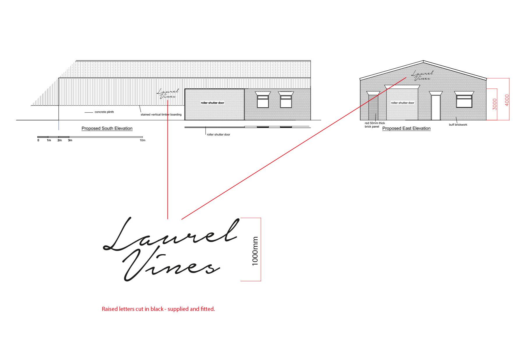
Over the years, we have helped Laurel Vines to evolve their brand as it began to feature in stylish restaurants and their clients were starting to demand a product which looks and felt more at home in these settings, as well as the farm shops and food festivals where the wine was initially retailing. We were called back in and given a clear brief of how the brand had developed and we were able to deliver a series of modern designs to help this growing brand to meet new heights culminating in the launch of their new website in 2023. This new website would help launch the vineyard as a venue for picnic and dining events as well as facilitating the sale of merchandise and cases of wine.
(Outcome)
Umber Creative is really proud of the work produced with Laurel Vines and that our working relationship with the team has spanned the lifespan of two branding projects and two iterations of the website and that we’ve helped them establish then reinvent this much loved Yorkshire, Wine of England brand.


